TL;DR
Dashboards break with fake data because most fake datasets are built for speed, not behavior. They look plausible in a table but fail the moment you rely on joins, drilldowns, filters, and time-series continuity. A dataset feels realistic when it behaves like production: relationships reconcile, values follow believable distributions, key fields correlate, and you can regenerate the same world deterministically.
Dashboards are data-sensitive products
A dashboard is UX built on a data model. That is why dashboards are usually the first place fake data gets exposed.
When the model is off, the UI starts to feel haunted. A KPI card shows one number while the drilldown implies another. A filter that should narrow the view returns an empty state that makes no product sense. The line chart renders, but it looks like noise instead of a system with trends, seasonality, and occasional spikes.
If you are building dashboards to demo, sell, or validate product decisions, this matters more than perfect pixels. A believable dashboard needs a believable model underneath.
Where fake data breaks first
Most generators optimize for “fast rows.” Dashboards care about system behavior. That gap creates predictable failure modes:
- Relational breaks: records exist, but joins do not reconcile cleanly.
- Correlation gaps: fields are generated independently, so segments tell nonsense stories.
- Timeline collapse: everything looks “recent,” which kills cohort, lifecycle, and churn analysis.
- Flat distributions: uniform randomness removes long tails, outliers, and realistic spikes.
- Irreproducible runs: demos and QA fail when you cannot regenerate the same dataset.
A useful mental model:
seed + schema version + generator config = reproducible dataset
Why dashboards amplify every data problem
Dashboards are multipliers. Small data issues surface as big UX issues.
Charts compress assumptions into one shape. Time-series needs continuity, aggregates need to reconcile with raw tables, and boundaries like month-end invoice cycles matter. Fake data often ignores those constraints, so the chart still renders but tells a story nobody trusts.
Filters and segments add another stress test. Segment sizes should feel stable and plausible over time. Early cohorts often churn more than mature ones. Higher-usage accounts are more likely to expand. If these relationships are missing, the dashboard feels like a skin over randomness.
Then comes the trust test: drilldowns. If a card says 1,200, the table should explain 1,200. If a chart spikes, the underlying rows should explain why.
A concrete example: SaaS metrics data
You do not need a huge schema. You need the right shape.
A minimal dashboard-ready model can be just four tables:
workspacessubscriptionsinvoicesevents
The key is relationship integrity: workspaces link to subscriptions, subscriptions link to invoices, and events link back to workspaces. From there, you can simulate behavior dashboards care about: signup trends, churn curves, upgrades and downgrades, invoice cadence, and occasional refunds.
That is enough for credible outputs like MRR trend, MRR by plan, churn over time, top accounts by revenue, and funnel views from event streams.
What “realistic” actually means
Realistic is not “looks plausible.” Realistic is “behaves like production.”
Use this quick gut-check:
- Join integrity: do joins always work, with no orphan rows?
- Field correlation: do key relationships behave realistically (for example, plan tier vs churn)?
- Distribution shape: do values include long tails and occasional spikes?
- Determinism: can you regenerate the same dataset on demand?
If these hold, your dashboard usually feels real even when every row is synthetic.
How to get realism without writing a backend
You do not need a custom backend to get believable behavior. You need a generation workflow that treats data like a system.
Start with an 80/20 schema matching your product. Encode correlations early because correlations are what make dashboards truthful. Add a few intentional edge cases, like refunds, downgrades, sparse segments, and one or two spikes, because these are exactly what break UI logic in production.
Most importantly, keep the seed and generator settings stable per environment so you can regenerate deterministically. If your workflow is Postgres-first, debugging and reconciliation are usually much easier because you can inspect real tables and joins directly.
Putting it into practice with Synthbrew
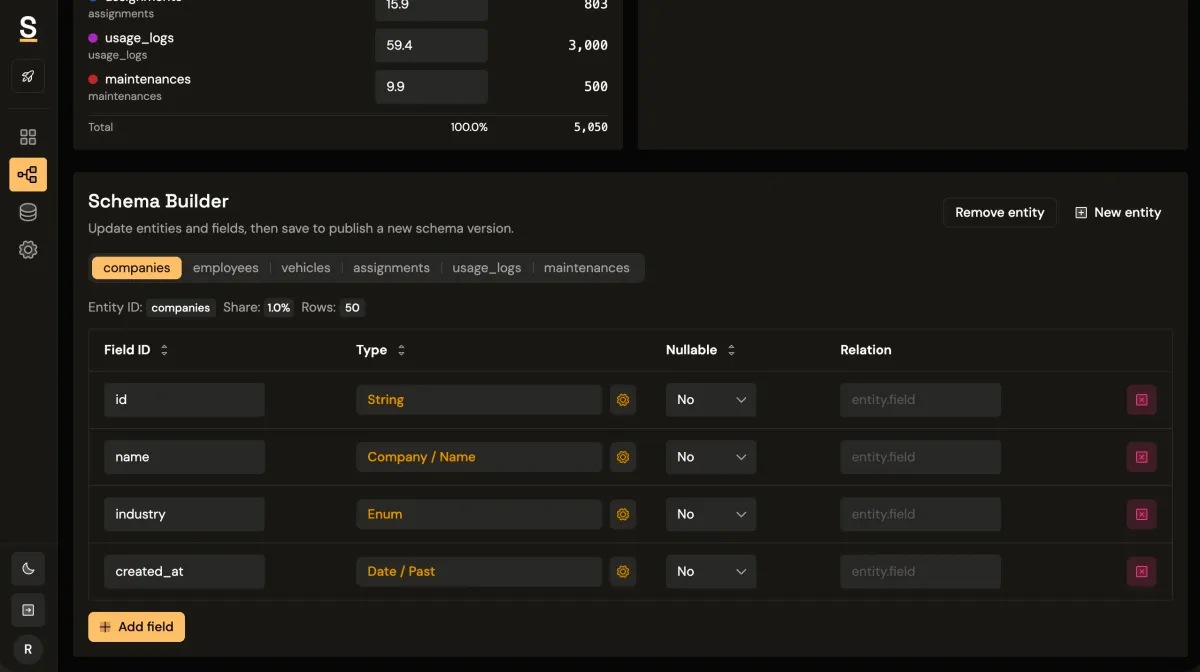
Synthbrew is designed around this system-level approach.
You can define a schema in SQL, the visual builder, or via AI prompt; publish immutable schema versions; and create separate sources pinned to a chosen version. Each source can represent a different environment, such as sales demo, QA, or edge-case testing.
From there, generate seeded relational data and connect your frontend via runtime CRUD endpoints authenticated with source API keys (x-api-key). On supported plans, you can also use read-only Postgres access for direct query workflows.
That gives teams a cleaner operating model:
- Sales uses polished story data in one source.
- Product tests behavioral flows in another.
- QA reruns deterministic scenarios without fixture drift.
If you want related implementation patterns, see schema versioning, seeded generation control, and runtime API key auth.
Rule of thumb
If your dashboard needs trust, your dataset needs behavior, not just rows.